business

The Professional Photographer's Marketing Toolkit

THE ESSENTIALS

1. business cards

Establish yourself as a professional. When someone asks for your card after you've told them you're a photographer, you don't want to be without them.

Click here for tips on designing your card. You can also visit fairwayprinting.com to learn more about our printing and graphic design services.

2. A professional email address

This can be either a Gmail account with your first and last name (and not a random assortment of numbers, letters, etc.) or one with a custom domain — something like info@yourname.com. You can get a custom email like this using Google's G Suite for $5 a month.

3. a website

A website will not only establish your professionalism, but it may also help you book more clients. People will want to know where they can find your work, and website portfolios are often expected these days.

Click here for tips on designing an effective portfolio site.

GOOD TO HAVE

4. Social media

Establish a professional social media presence.

If you're going to be on one network, it should probably be Instagram. Here are some tips on using the platform to advance yourself as professional photographer and differentiate yourself from the average Instagram user.

Facebook and Tumblr are also good platforms for showing your work.

5. call sheets

This document will include all of the information that you and your crew will need do know before, during (and even after) a photoshoot — things like contact information, location details, your concept and timeline.

By making this part of your toolkit, you can keep yourself organized while impressing clients and making things easy for everyone you’re working with.

Here are some tips on putting together your own call sheet. We've also included a template that you can customize.

6. Price sheets

In addition to business cards, you might often get asked if you have a price sheet. While your pricing might vary depending on the particular job, if there's a certain service you specialize in — such as portrait sessions or headshots — you can use a price sheet to put together some package options. Learn more about how to package your services here.

NICE TO HAVE

7. Thank you notes

If you really want to impress your clients, consider sending thank you notes. Get custom-printed cards with your own images and logo. Your clients will appreciate this unexpected touch.

8. welcome packets

Some wedding, portrait and headshot photographers offer welcome packets, which include information such as how to prepare for their photoshoot, pricing for prints and retouching, terms and condition, etc.

Need help designing or printing your marketing materials? Visit fairwayprinting.com to learn more about our printing and graphic design services.
How to Package Your Photography Services and Design a Price Sheet

Once you've set your basic rates for your photography services, consider putting together some package deals. Packages can make your sessions more appealing to clients while making things easier on your end (as you'll have a template for your sessions). By grouping and suggesting services, they can also help you make more money.

We've put together some tips below on how to organize your offerings and set up a professional price sheet.

Keep it simple

Keep your price menu as clean and clutter-free as possible. Your goal is to design a sheet that's easy to scan. Your clients should be able to tell the difference between your packages quickly, so focus on large differences over minor, incremental ones.

If there are features or offerings that apply to all of your sessions, list these at the top of your sheet rather than repeating them under each package. Repeating information and presenting them as features for each of your packages will not necessarily make them look more appealing. Only list what's adding real value.

Offer 3 or 4 packages

Most photographers' price sheets include 3-4 packages:

  • Package #3 or #4 will be your deluxe package. It's for clients who want to splurge, and includes all the bells and whistles. It's not necessarily what you're trying to sell, but it's designed to make your other packages appear reasonable in comparison.

  • Package #2 will be your most appealing option. Itshould draw attention to what's missing from Package #1, and highlight what they can get from Package 2 for just a bit more money.

  • Package #1 provides an entry-point for people who are interested in your services, but are not quite ready to spend.

As you're deciding what to include in each package, think about what your clients really want. Don't just list everything you can offer — what do your clients actually need? If you design your packages right, people won't be requesting to swap out features all the time.

You might also find it helpful to have an 'a-la-cart' list on the side of your price sheet, featuring add-ons for each package.

list your most expensive package first

Again, your highest package is designed to make your other options seem reasonable. As your clients read from top to bottom, they will see all the features they're missing out on if they go with the lowest package. This will also make your price sheet easier to read: you'll be taking away options, instead of adding more.

choose your words carefully

Here's a great example of word choose can affect your packaging, from an article on Virtual Photography. Take this list of words:

Shoot / Photograph
Images / Pictures
Collections / Packages

While you might use the word "shoot" more often than "photograph," put yourself in your clients' shoes — which sounds more appealing?

Think about who you're marketing to, and adjust your wording accordingly. If you're a wedding photographer, for example, opt for language that sounds more high-end and elegant.


Need help with your design set-up? Or a place to print your finished product? Contact us. You can learn more about our printing and design services at fairwayprinting.com

Why You Need a Photographic Niche (And How to Find One)

Why find a photographic niche?

Establish credibility and build your reputation. This can help you bring in referrals. If someone is looking for a wedding photographer, for example, they are most likely going to ask their friends if they know a good wedding photographer, specifically. Same goes for newborns, headshots, etc.

Focus your marketing efforts. When you narrow your target market, your marketing efforts will be more effective. You'll have a more focused and higher quality message, and a better understanding of where to promote yourself. You're more likely to find the people who want what you're selling.

Stand out from the crowd. Consider a more specific, uncommon niche — such as tattoo photography — that will help you stand out. While you may not be casting the widest net, for those who are interested, you've caught their attention and established yourself as an expert — you'll be the go-to person.

How to choose a niche

Some questions to ask yourself: 

  • What do you enjoy doing?
  • What are you good at?
  • How well does it pay?
  • What is the competition?
  • How difficult is it to break into?
  • Is there any special equipment required?
  • Is it contingent on location?

Some common niches

  • weddings
  • newborns
  • children / families
  • portraits
  • headshots
  • fashion
  • stock
  • product
  • food
  • landscape
  • street
  • architecture
  • travel

How to Use Instagram as a Professional Photographer

If you're going to be on one social network as a photographer, it should probably be Instagram. Here are some tips on using the platform to effectively promote your work and distinguish yourself from the average user.

1. Instagram is not your portfolio.

Don't simply regurgitate everything that’s in your portfolio. Have some fun with it. Experiment, and share spontaneous shots that may not be published elsewhere.

You can think of it as a visual diary: give your followers a glimpse into your life, or a behind-the-scenes look at a project you’re working on.

With all this in mind, remember that you're trying to promote yourself as a professional. Create a sense of balance between more carefully planned out photos and more impromptu ones.

2. Be consistent in your subject matter.

Let people know what to expect. When someone lands on your feed and sees a general theme — whether it's landscapes, portraits or street photography — it gives them a reason to follow you.

3. Use a consistent editing style.

Whether you’re posting photos from your DSLR, iPhone camera or both, establish an editing process. Most photographers prefer third-party apps — such as VSCO Cam or Adobe Lightroom Mobile — to Instagram’s built-in editing features. (To distinguish yourself from “Instagram photographers,” you may want to avoid Instagram filters.) Keep in mind that your Instagram photos will be viewed at small sizes, so you don’t have to worry so much about details like noise and grain.

By using a consistent editing process, your feed will have an overall cohesive look.

4. Write a good bio.

This is the first thing people will see. Keep it short and to the point. Include a link to your website, as well as your email and location, so people who want to work with you will know how to contact you and where you’re based.

5. Write short descriptions for your photos.

Include a description with every image, and be concise. If your text is longer than a few lines, people will have to click "expand" to read the rest.

Add context to your images. If you’re posting a photo of a landmark, for example, name it in the description and use the location tool.

6. Use hashtags wisely.

Don’t insert hashtags into every other word of your photo description — it looks unprofessional (ex: This is yesterday’s #model at my #photoshoot in #nyc). Instead, attach them to the end of your post, and don’t go overboard. If you’re using a lot of hashtags, post them as a comment instead of in the original description.

Do some research and experimenting in deciding which hashtags to use. Keep in mind that if you use popular ones like #photography, you might end up with a lot of spam and bot comments. Try to find some niche hashtags that describe your photography style and are not overused.

Once you’ve found what works for you, you can use apps like Tagsdock to create custom hashtag lists that you can re-use to save time.

7. Engage with the Instagram community.

Find and connect with photographers who inspire you, and follow accounts that you are genuinely interested in. Join conversations in a meaningful way (don’t just spam for followers). And be sure to reply to people who comment on your work. 

There are a lot of “quick fixes” to build your following, but if you share great content and explore Instagram from a place of genuine interest, you’ll grow your following organically with followers who are you actually interested in your work.

8. Keep a regular schedule.

Don’t flood your followers’ feeds by posting a series of photos all at once. Post once a day, or every three days. Whatever you decide, keep a regular schedule.

* * *

Don’t overthink it, don’t be afraid to be emojis and remember to have fun with it. While you should have a general plan for how you’ll use your account, as well as an editing system in place, Instagram is about sharing images quickly and with ease. And don’t forget that it’s a social network. Ideally, you’re connecting with other photographers by following their work and sharing your own.

Portfolio Website Tips for Photographers

for your portfolio ...

  • Don’t include all of your work – just your best. Be selective and show what you’re proud of.
  • What type of work do you want to be hired for? Make this the focus of your portfolio.
  • Keeping that in mind, you’ll also want to show your range.
  • Be strategic about the order. Place your best photos at the beginning and end. Draw your visitors in, and then make the ending memorable.
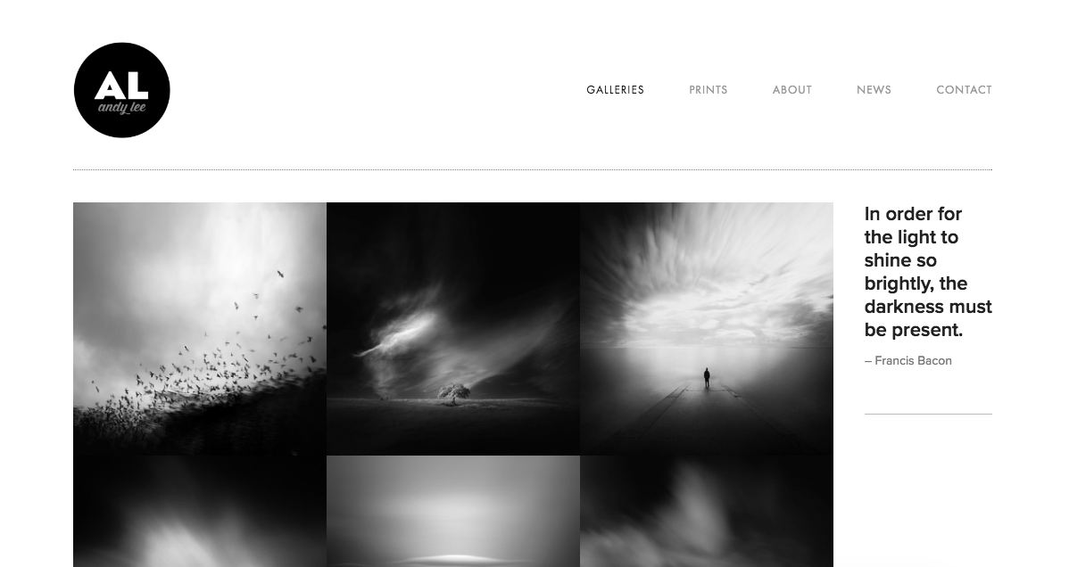
photography portfolio gallery example

for your website design ...

  • Use a simple, clean design. Let your photography be the focus.
  • If you’re using a template, make it your own: change the fonts, colors, etc.
  • Don’t go overboard: stick to just a couple fonts.
  • Make the navigation simple and easy to use, without too many menu items. If all you have is “about,” “contact,” and “portfolio,” that’s fine.
  • Make your contact information easy to find. Depending on your layout, you may want to put it in your footer or header so that it shows up on every page.
  • Understand your audience. What type of clients are you trying to attract? This will affect your design choices. If you’re a corporate photographer, for example, your fonts and colors should convey professionalism. Wedding photographers typically make use of white space and feminine typography.
photographer's website example

for your about page ...

  • Make it clear, concise, and creative.
  • What’s your approach to photography? What do you love about it? Tell the story of what led you to this point of view. Talk about how you got started, and what your plans are for the future.
  • Make it personal. Include a few unique details about yourself.
  • Make sure to have a great self-portrait! 
photographer's website about page example

Business Card Tips for Photographers

Prioritize your contact information.

The purpose of a business card is to make it easy for people to contact you. Prioritize this when you’re designing your card. Make sure your contact information is easy to spot at a quick glance, and easy to read. Keep it all on one side.

The most important things to include will probably be your name, phone number, email address, a link to your website, and possibly social media handles (if there's room).

Use consistent branding in your design.

Match your design to the aesthetic of your portfolio. Ideally, your card will give people an idea of what type of work you do.

Who is your ideal client? This will influence your design, and determine whether you want something artsy, for example, or playful, or if you'll need a more sleek and polished look.

Think about practicality.

Again, keep all of your contact information — and other critical info — on one side. Your other side can feature your logo, a picture, and other non-critical information. Most photographers choose to utilize both sides of the card.

Keep fonts simple and easy-to-read. In general, you’ll want to stick to two. 

As a photographer, you’ll want to make sure that your business card shows that you have good design sense. Photo editors and art buyers really pay attention to things like font choice, shapes, and color.

Consider including a photo.

Use your card to show off one of your photos. This will give people an idea of what type of work you do. Choose carefully, though. This might be the one chance you have to inspire someone to view the rest of your portfolio.

Make sure that the photo you choose is representative of your work. If you generally shoot portraits, your business card should feature a portrait, not a landscape.

You may also choose to show a couple smaller photos.

* * *

Visit fairwayprinting.com to learn more about our printing and design services.