How to Master Headshot Photography

Headshots play an important role in helping models, actors and other entertainment professionals land gigs. Master the headshot as a photographer and you’ll have lots of happy clients.

To the amateur or non-photographer, the headshot may seem like an easy shot to capture (just crop the person’s face, right?). But, of course, there’s an art to doing it well.

While headshots can be done many ways, the following guide is for traditional headshots taken in a studio on a white background, though many of the tips can be applied to outdoor sessions and other settings. It follows industry standards and will work for most model, actor and corporate headshot photos. Once learned, you’ll be able to easily replicate the process.

SETUP

Two diffused lights, one on each side, should give you a nice, natural look. Our typical setup at Fairway is one large and one medium softbox angled towards the subject. You want to discourage shadows and harsh lighting. For your camera, avoid wide angle lenses and opt for something that will slim your subject’s face.

If you have the equipment to shoot tethered, this can work really well for headshot sessions. When your subject sees their image appear on the screen in real-time, they’ll be able to see what needs to be changed and make their own adjustments throughout the shoot.

POSING

Make sure your subject isn’t too close to the background as to create shadows. You can have them turn their body 45 degrees from the camera, with their face straight towards the camera. Many people will be more comfortable sitting down, so have a stool handy.

Guide your subject and ask them to make small adjustments throughout the shoot. Ask them to smile, tilt their head, pull their shoulders back, etc. Get a variety of shots and don’t be afraid to make specific requests.

CAPTURING THE SHOT

The two most important things to keep in mind are framing and eye contact.

In general, you’ll want to crop in close to the head, leaving just a bit of room between the top of the head and frame. Shoot above the chest but don’t lose the neck and shoulders, or you’ll end up with a floating head. Shooting too far down or below the chest can also make for awkward framing and may distract from the face.

When in doubt, use the Rule of Thirds to compose your image. If you’re cropping in close, try aligning the eyes with the third line of your imaginary grid. (Here’s some info on how to use the Rule of Thirds.)

The eyes are the most important part of a headshot, so make sure that they are in focus (using focal lock) and that your subject is looking directly at the camera.

Though your images can of course be cropped in post-editing, try to crop in camera. In other words, take the photo as you intend it to appear in the final version. It’s more professional and will simplify things for both you and your client, as you won’t have to make mental re-calibrations as you’re looking through the photos. Your client will be able to quickly tell if they got the shot they’re looking for.

The crop should remain consistent throughout. Your subject will be moving as you scroll through the photos, but their head shouldn’t jump all over the frame. It should feel more like a flip book.

WORKING WITH YOUR SUBJECT

Talk to your client before your session, whether on the photo or in person, and let them know what to expect. Find out what the headshots will be used for, advise them on what to wear (more on that below), and find out if they have any specific goals for their session. Some people will be nervous about having their photo taken, but a quick conversation that demystifies the process should help.

Keep talking throughout your shoot, guiding posing and expression, making conversation, and reassuring your client that you’re getting great shots. Long silences will be uncomfortable and will not produce great photos! Keep things light and relaxed.

CLOTHING

Solid, neutral colors generally work best for headshots. Remember that the focus should be on the face, so you’ll want to avoid distracting clothing and accessories. You can tell your client to aim for a simple, professional look that they’re comfortable in.

Specific how many “looks,” or outfit changes, are included with your rate. A corporate headshot session might include one formal look (a blazer, button-up or blouse) and one casual look. You can also play with layers — for example, taking a few photos without the blazer.

Still have questions? Comments? Let us know!
6 Posing Tips for Portrait Photography

1. Pose the hair.

If your subject has long hair, help them pose it. Avoid letting the hair sit on the shoulders — it doesn’t photograph well. Instead, have them position their hair so that it’s:

a) all behind the shoulders
b) all in front of the shoulders, evenly on both sides
c) all in front of one shoulder (try both sides; one will look better than the other)

Make adjustments throughout your shoot and see what works best.

2. Don’t shoot your subject head-on.

Have them turn slightly to the side, about a 3/4-turn away from the camera, for a slimmer look. If your subject faces the camera directly, the shoulders can look especially wide, resulting in your subject appearing wider than they actually are.

3. Chin down and forward.

People have a natural tendency to lean backwards in photos, resulting in an unflattering portrait — you may see up their nose, get a double-chin, and their eyes may appear partially closed. To counteract this, direct your subject to bring their chin down and forward.

4. “If it bends, bend it.”

Follow this mantra from photographer Deanna McCollum. Encourage your model to create a soft bend in their elbows, fingers. Have them bend their front knee, or tilt their head slightly.

This helps add visual interest to your photos with diagonal lines. If everything in your photo is strictly horizontal, your subject will look stiff and unrelaxed.

5. Shift their weight.

Have your subject put their weight on their back foot. They’ll look more relaxed, and it will also help some of the tips mentioned above fall into place naturally: they’ll face slightly away from the camera, and they’ll typically place their hand on their hip.

6. Communicate!

Give lots of direction throughout your shoot. Keep your subject moving. They’ll feel more comfortable and relaxed.

When you find a pose that’s working, capture it at different angles and then have your model make small adjustments (hand in pocket, change where they’re looking, fix their hair, etc.) until it flows naturally into a new pose.

The Professional Photographer's Marketing Toolkit

THE ESSENTIALS

1. business cards

Establish yourself as a professional. When someone asks for your card after you've told them you're a photographer, you don't want to be without them.

Click here for tips on designing your card. You can also visit fairwayprinting.com to learn more about our printing and graphic design services.

2. A professional email address

This can be either a Gmail account with your first and last name (and not a random assortment of numbers, letters, etc.) or one with a custom domain — something like info@yourname.com. You can get a custom email like this using Google's G Suite for $5 a month.

3. a website

A website will not only establish your professionalism, but it may also help you book more clients. People will want to know where they can find your work, and website portfolios are often expected these days.

Click here for tips on designing an effective portfolio site.

GOOD TO HAVE

4. Social media

Establish a professional social media presence.

If you're going to be on one network, it should probably be Instagram. Here are some tips on using the platform to advance yourself as professional photographer and differentiate yourself from the average Instagram user.

Facebook and Tumblr are also good platforms for showing your work.

5. call sheets

This document will include all of the information that you and your crew will need do know before, during (and even after) a photoshoot — things like contact information, location details, your concept and timeline.

By making this part of your toolkit, you can keep yourself organized while impressing clients and making things easy for everyone you’re working with.

Here are some tips on putting together your own call sheet. We've also included a template that you can customize.

6. Price sheets

In addition to business cards, you might often get asked if you have a price sheet. While your pricing might vary depending on the particular job, if there's a certain service you specialize in — such as portrait sessions or headshots — you can use a price sheet to put together some package options. Learn more about how to package your services here.

NICE TO HAVE

7. Thank you notes

If you really want to impress your clients, consider sending thank you notes. Get custom-printed cards with your own images and logo. Your clients will appreciate this unexpected touch.

8. welcome packets

Some wedding, portrait and headshot photographers offer welcome packets, which include information such as how to prepare for their photoshoot, pricing for prints and retouching, terms and condition, etc.

Need help designing or printing your marketing materials? Visit fairwayprinting.com to learn more about our printing and graphic design services.

How to Package Your Photography Services and Design a Price Sheet

Once you've set your basic rates for your photography services, consider putting together some package deals. Packages can make your sessions more appealing to clients while making things easier on your end (as you'll have a template for your sessions). By grouping and suggesting services, they can also help you make more money.

We've put together some tips below on how to organize your offerings and set up a professional price sheet.

Keep it simple

Keep your price menu as clean and clutter-free as possible. Your goal is to design a sheet that's easy to scan. Your clients should be able to tell the difference between your packages quickly, so focus on large differences over minor, incremental ones.

If there are features or offerings that apply to all of your sessions, list these at the top of your sheet rather than repeating them under each package. Repeating information and presenting them as features for each of your packages will not necessarily make them look more appealing. Only list what's adding real value.

Offer 3 or 4 packages

Most photographers' price sheets include 3-4 packages:

  • Package #3 or #4 will be your deluxe package. It's for clients who want to splurge, and includes all the bells and whistles. It's not necessarily what you're trying to sell, but it's designed to make your other packages appear reasonable in comparison.

  • Package #2 will be your most appealing option. Itshould draw attention to what's missing from Package #1, and highlight what they can get from Package 2 for just a bit more money.

  • Package #1 provides an entry-point for people who are interested in your services, but are not quite ready to spend.

As you're deciding what to include in each package, think about what your clients really want. Don't just list everything you can offer — what do your clients actually need? If you design your packages right, people won't be requesting to swap out features all the time.

You might also find it helpful to have an 'a-la-cart' list on the side of your price sheet, featuring add-ons for each package.

list your most expensive package first

Again, your highest package is designed to make your other options seem reasonable. As your clients read from top to bottom, they will see all the features they're missing out on if they go with the lowest package. This will also make your price sheet easier to read: you'll be taking away options, instead of adding more.

choose your words carefully

Here's a great example of word choose can affect your packaging, from an article on Virtual Photography. Take this list of words:

Shoot / Photograph
Images / Pictures
Collections / Packages

While you might use the word "shoot" more often than "photograph," put yourself in your clients' shoes — which sounds more appealing?

Think about who you're marketing to, and adjust your wording accordingly. If you're a wedding photographer, for example, opt for language that sounds more high-end and elegant.


Need help with your design set-up? Or a place to print your finished product? Contact us. You can learn more about our printing and design services at fairwayprinting.com

Why You Need a Photographic Niche (And How to Find One)

Why find a photographic niche?

Establish credibility and build your reputation. This can help you bring in referrals. If someone is looking for a wedding photographer, for example, they are most likely going to ask their friends if they know a good wedding photographer, specifically. Same goes for newborns, headshots, etc.

Focus your marketing efforts. When you narrow your target market, your marketing efforts will be more effective. You'll have a more focused and higher quality message, and a better understanding of where to promote yourself. You're more likely to find the people who want what you're selling.

Stand out from the crowd. Consider a more specific, uncommon niche — such as tattoo photography — that will help you stand out. While you may not be casting the widest net, for those who are interested, you've caught their attention and established yourself as an expert — you'll be the go-to person.

How to choose a niche

Some questions to ask yourself: 

  • What do you enjoy doing?
  • What are you good at?
  • How well does it pay?
  • What is the competition?
  • How difficult is it to break into?
  • Is there any special equipment required?
  • Is it contingent on location?

Some common niches

  • weddings
  • newborns
  • children / families
  • portraits
  • headshots
  • fashion
  • stock
  • product
  • food
  • landscape
  • street
  • architecture
  • travel

How to Use a Power Pack with Flash Heads

One of the benefits of studio photography is that ability to take advantage of off-camera flash, which provides more power and control than an on-camera flash. There are several different options for off-camera strobe lighting: speedlights, monoblocks, and power pack / flash head combinations.

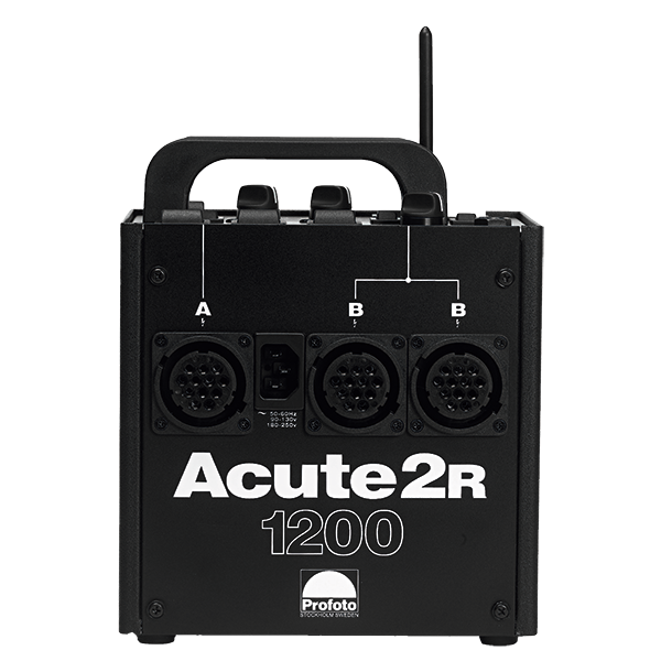
Packs and flash heads are the most powerful option. Though they are not very portable, they are perfect for studio shoots. At Fairway, we include a Profoto Acute 2R 1200 Power Pack and two Pro 7 Flash Heads with our studio rentals. Here’s what you need to know about using this equipment. 


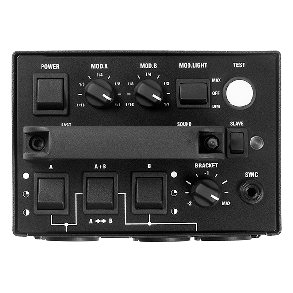
This is a power pack. It's a generator that operates on AC power (so it must be plugged into the wall). The Acute 2R 1200 Pack has a power output of 1200W, and three ports for connecting flash heads (labeled here as "A" and "B"). 


This is a flash head. It should be attached to a light stand and can be outfitted with a softbox, reflector, umbrella or other light modifier — all of which provide different qualities of lighting.

A typical setup we use at Fairway, for example, is a flash head with a large softbox on our righthand side, and a flash head with a medium softbox on the left. The smaller softbox serves as the fill light, meaning it's used to fill in the shadows produced by our main light.

Softboxes produce soft, even lighting. Click to learn more about the different lighting produced by softboxes and umbrellas.


The flash heads do not light continuously; they are controlled wireless by a Pocketwizard Transmitter and Receiver. The Transmitter is attached with a wire to the Power Pack, and the Receiver hooks up to the top of your camera. Make sure they are set to the same channel. When you press the shutter and take your photo, the flash heads will light automatically.


Understanding the Power Pack Controls and Settings:

  • MOD.A, MOD.B, MOD.LIGHT — these settings control the "modeling lights." Modeling lights allow you to see where the light will hit. When the modeling lights are on, the strobes will light continuously at a more modest setting.
  • If you want to set off the strobes without taking a photo, press the white TEST button.
  • The strobes will not work unless the TEST button, or "ready lamp", is lit up. It resets every 1/4-second, typically. The more power you use, the slower the recycle time. We recommend turning the SOUND setting on, so the pack will beep when the ready lamp lights up again. 
  • Each light can be set to full power, half power or quarter power. This is controlled using the switches labeled A and B. Remember that the more power you use, the slower the recycle time (it's best not to use more than necessary).
  • You can use symmetrical or asymmetrical power distribution between your lights. To control the power setting of each light individually, select the A+B setting. For symmetrical distribution, select A <--> B.
  • SYNC — This is where you plug in the transmitter cord.

Camera Settings + Lighting

Set your camera to manual mode. You'll need to set your aperture and exposure settings. For studio lighting, you'll typically use an aperture between f8 and f12 and a shutter speed of about 1/200 with your iso at 100-400. If you find that your lighting is too dark or too light, you can either adjust your camera's settings or the power settings of your lights, as well as their placements.

How to Use Instagram as a Professional Photographer

If you're going to be on one social network as a photographer, it should probably be Instagram. Here are some tips on using the platform to effectively promote your work and distinguish yourself from the average user.

1. Instagram is not your portfolio.

Don't simply regurgitate everything that’s in your portfolio. Have some fun with it. Experiment, and share spontaneous shots that may not be published elsewhere.

You can think of it as a visual diary: give your followers a glimpse into your life, or a behind-the-scenes look at a project you’re working on.

With all this in mind, remember that you're trying to promote yourself as a professional. Create a sense of balance between more carefully planned out photos and more impromptu ones.

2. Be consistent in your subject matter.

Let people know what to expect. When someone lands on your feed and sees a general theme — whether it's landscapes, portraits or street photography — it gives them a reason to follow you.

3. Use a consistent editing style.

Whether you’re posting photos from your DSLR, iPhone camera or both, establish an editing process. Most photographers prefer third-party apps — such as VSCO Cam or Adobe Lightroom Mobile — to Instagram’s built-in editing features. (To distinguish yourself from “Instagram photographers,” you may want to avoid Instagram filters.) Keep in mind that your Instagram photos will be viewed at small sizes, so you don’t have to worry so much about details like noise and grain.

By using a consistent editing process, your feed will have an overall cohesive look.

4. Write a good bio.

This is the first thing people will see. Keep it short and to the point. Include a link to your website, as well as your email and location, so people who want to work with you will know how to contact you and where you’re based.

5. Write short descriptions for your photos.

Include a description with every image, and be concise. If your text is longer than a few lines, people will have to click "expand" to read the rest.

Add context to your images. If you’re posting a photo of a landmark, for example, name it in the description and use the location tool.

6. Use hashtags wisely.

Don’t insert hashtags into every other word of your photo description — it looks unprofessional (ex: This is yesterday’s #model at my #photoshoot in #nyc). Instead, attach them to the end of your post, and don’t go overboard. If you’re using a lot of hashtags, post them as a comment instead of in the original description.

Do some research and experimenting in deciding which hashtags to use. Keep in mind that if you use popular ones like #photography, you might end up with a lot of spam and bot comments. Try to find some niche hashtags that describe your photography style and are not overused.

Once you’ve found what works for you, you can use apps like Tagsdock to create custom hashtag lists that you can re-use to save time.

7. Engage with the Instagram community.

Find and connect with photographers who inspire you, and follow accounts that you are genuinely interested in. Join conversations in a meaningful way (don’t just spam for followers). And be sure to reply to people who comment on your work. 

There are a lot of “quick fixes” to build your following, but if you share great content and explore Instagram from a place of genuine interest, you’ll grow your following organically with followers who are you actually interested in your work.

8. Keep a regular schedule.

Don’t flood your followers’ feeds by posting a series of photos all at once. Post once a day, or every three days. Whatever you decide, keep a regular schedule.

* * *

Don’t overthink it, don’t be afraid to be emojis and remember to have fun with it. While you should have a general plan for how you’ll use your account, as well as an editing system in place, Instagram is about sharing images quickly and with ease. And don’t forget that it’s a social network. Ideally, you’re connecting with other photographers by following their work and sharing your own.

Photoshoot Prep Checklist

There are a lot of moving parts to consider when you're coordinating a photoshoot. We put together a list of some things to keep track of.

The Week of the Shoot

  • Confirm with everyone involved.

  • Send call sheet to crew.

  • Prepare mood board and/or shot list, lighting plans, etc.

  • Review equipment list. Indicate:

    • equipment you are bringing

    • equipment provided by the studio

    • additional equipment needed

      • Make arrangements for rental equipment if necessary.

  • Scout location; know what to expect.

    • Check out food and parking nearby, etc.

The Day Before the Shoot

  • Review equipment list and pack gear.

  • Charge camera batteries.

  • Pack backup equipment.

    • battery

    • memory card

  • Check camera settings.

  • Format memory card.

  • Clean lenses.

  • Check directions.

  • Review details such as shot list, client requests, etc.


How to Use Focal Lock for Precise Focus

Use focal lock to ensure the right parts of your photo are in focus.

Your camera’s autofocus tool will typically focus on the center of your frame — so it’s not the most reliable tool when your subject is off-center. Focal locking allows you to select the exact spot you want in focus.

Here’s how to do it: 

  1. Pose your subject and compose your shot.

  2. Aim your camera's focal point (it will light up red in your viewfinder) at the exact spot you want to focus on. Press the shutter button down halfway.

  3. Without releasing the shutter, move your camera back to recompose the shot. Then press the button down fully to take your shot.

In your final image, the initial spot where you pressed the shutter halfway will be in focus, even though you moved the camera afterwards.

In addition to being used for off-center subjects, focal locking can be used in standard portraits for sharply focused eyes: frame your subject, pull your camera up to lock the focus on the eyes, then pull the camera back down to position your subject in the center of the frame.

Creating Your Call Sheet

call sheet example

A call sheet is a document with all of the information that you and your crew will need do know before, during (and even after) a photoshoot — things like contact information, location details, your concept and timeline.

This master sheet is important to have when you’re working with a big crew or producing film, but it’s also really helpful for smaller photoshoots with just a few people involved. By making this part of your toolkit, you can keep yourself organized while impressing clients and making things easy for everyone you’re working with. It’s an easy extra step to take, especially if you have a template.

Some important details a call sheet might include:

  • important contact information

  • date, day of week, time

  • location details — Where are you meeting? Will there be any secondary locations? You might also include a Google Maps link, parking options, etc.

  • names of people involved — Let people know what to expect. List the names of your crew, talent, hair/makeup and anyone else who will be part of your project. (You don’t have to include everyone’s contact information — this could get confusing.)

  • timeline — What’s your arrival time? When will be you setting up, and when do you want to start shooting? Will there be any breaks? When’s wrap-up? You might also want to include here whether there will be coffee or breakfast provided when you get there, what you will be doing for lunch, etc. Indicate whether certain members of your team can arrive at different times.

  • concept — Include a briefing of your concept. You might also want to provide an attachment or link to a more detailed mood board.

  • wardrobe — Detail any outfits that models should bring themselves, and whether there’s anything to be avoided.

  • special instructions — A section with any other important details that people should know.


Portfolio Website Tips for Photographers

for your portfolio ...

  • Don’t include all of your work – just your best. Be selective and show what you’re proud of.
  • What type of work do you want to be hired for? Make this the focus of your portfolio.
  • Keeping that in mind, you’ll also want to show your range.
  • Be strategic about the order. Place your best photos at the beginning and end. Draw your visitors in, and then make the ending memorable.
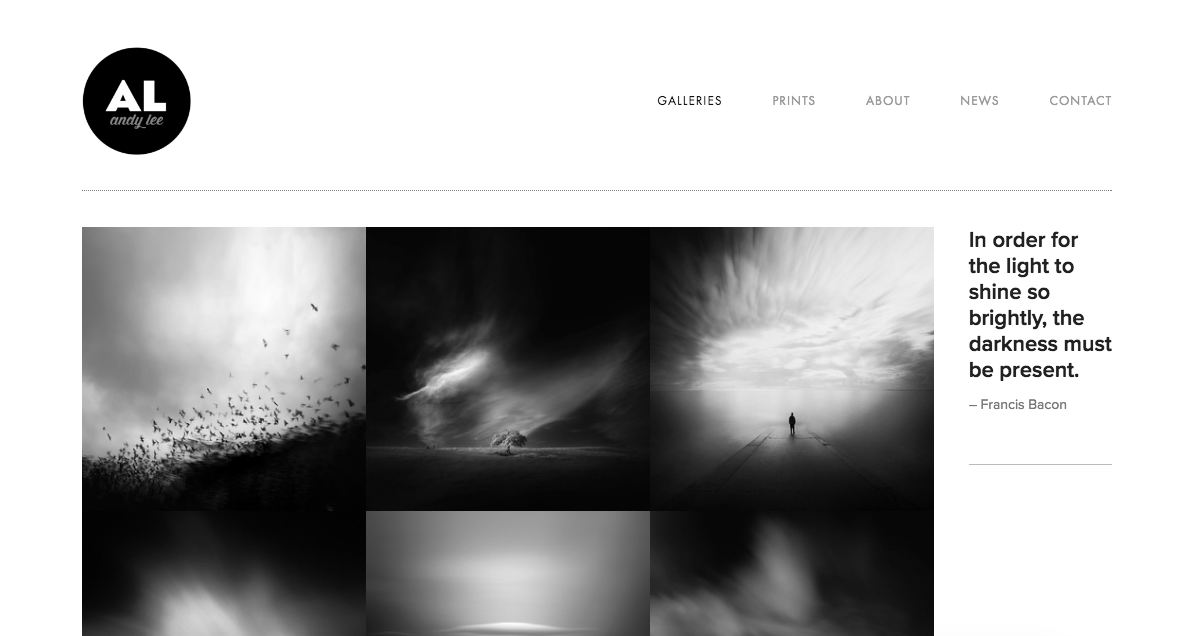
photography portfolio gallery example

for your website design ...

  • Use a simple, clean design. Let your photography be the focus.
  • If you’re using a template, make it your own: change the fonts, colors, etc.
  • Don’t go overboard: stick to just a couple fonts.
  • Make the navigation simple and easy to use, without too many menu items. If all you have is “about,” “contact,” and “portfolio,” that’s fine.
  • Make your contact information easy to find. Depending on your layout, you may want to put it in your footer or header so that it shows up on every page.
  • Understand your audience. What type of clients are you trying to attract? This will affect your design choices. If you’re a corporate photographer, for example, your fonts and colors should convey professionalism. Wedding photographers typically make use of white space and feminine typography.
photographer's website example

for your about page ...

  • Make it clear, concise, and creative.
  • What’s your approach to photography? What do you love about it? Tell the story of what led you to this point of view. Talk about how you got started, and what your plans are for the future.
  • Make it personal. Include a few unique details about yourself.
  • Make sure to have a great self-portrait! 
photographer's website about page example

Defining Your Concept: Tips for Creating a Mood Board

The first step to preparing for a photoshoot is to define your concept. If you have a general vision, but you're not exactly sure how to articulate or execute it, a mood board will help.

Simply put, a mood board is a collage of inspiration to be used as a reference point before and during your photoshoot. It will help you clarify your vision while getting the rest of your team on the same page.

Some tips for putting one together:

1. It’s helpful if you have lots to pull from when it comes time to decide on your concept, so you should always be collecting images and sources of inspiration. Collect tear sheets, save images to a folder on your desktop, make use of your screenshot tool, and take lots of pictures on your phone. Even if you’re not sure where or when you’ll use it, if you see something that inspires you, save it for later.

Programs like Evernote will let you store everything in one place — photos, notes, articles, lists — and then organize your files with folders and tags (check out this article on using Evernote for mood boards).

2. Have a visual reference point for every aspect of your shoot: hair, makeup, wardrobe, lighting, models, model poses, and props. If you’re working with a team, it can be helpful to dedicate a section of your mood board to each member of your team — your stylist, makeup artist, model, etc.

3. Start with a folder, Pinterest board, etc. with all of your sources of inspiration, and then edit it down to a cohesive final mood board. Don’t overwhelm yourself (or your team) with too many images. You can simply arrange your photos on a page in Photoshop, or use an online tool such as Moodboard, Mural.ly, Niice, or Pixelboard.

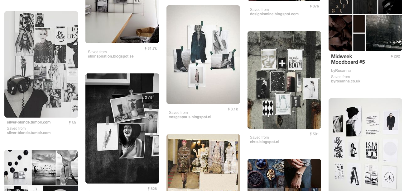
mood board examples

Business Card Tips for Photographers

Prioritize your contact information.

The purpose of a business card is to make it easy for people to contact you. Prioritize this when you’re designing your card. Make sure your contact information is easy to spot at a quick glance, and easy to read. Keep it all on one side.

The most important things to include will probably be your name, phone number, email address, a link to your website, and possibly social media handles (if there's room).

Use consistent branding in your design.

Match your design to the aesthetic of your portfolio. Ideally, your card will give people an idea of what type of work you do.

Who is your ideal client? This will influence your design, and determine whether you want something artsy, for example, or playful, or if you'll need a more sleek and polished look.

Think about practicality.

Again, keep all of your contact information — and other critical info — on one side. Your other side can feature your logo, a picture, and other non-critical information. Most photographers choose to utilize both sides of the card.

Keep fonts simple and easy-to-read. In general, you’ll want to stick to two. 

As a photographer, you’ll want to make sure that your business card shows that you have good design sense. Photo editors and art buyers really pay attention to things like font choice, shapes, and color.

Consider including a photo.

Use your card to show off one of your photos. This will give people an idea of what type of work you do. Choose carefully, though. This might be the one chance you have to inspire someone to view the rest of your portfolio.

Make sure that the photo you choose is representative of your work. If you generally shoot portraits, your business card should feature a portrait, not a landscape.

You may also choose to show a couple smaller photos.

* * *

Visit fairwayprinting.com to learn more about our printing and design services. 

How to Use a Reflector

A reflector is a type of light modifier that is used to bounce (or reflect) existing light. It’s a portable, flexible tool that can dramatically enhance the lighting in your photos. They are easy to manipulate and experiment with.

Most reflectors you’ll see will be a piece of reflective fabric stretched over a flexible ring. However, there are many different types which differ in size, shape, and color.

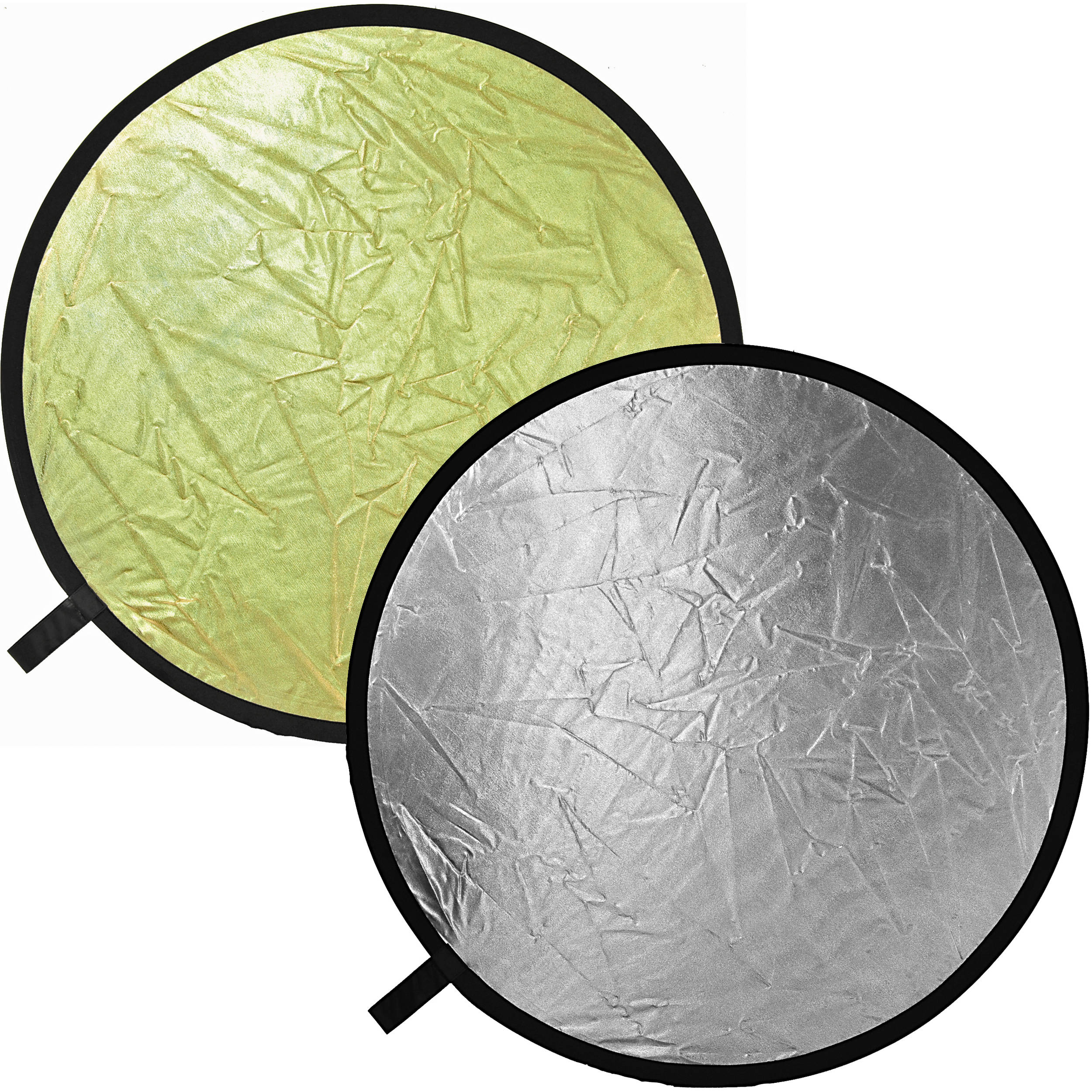
silver and gold reflectors

CHOOSING A REFLECTOR

For portraits, a small reflector is usually suitable, and it will be easier to handle. Larger reflectors will diffuse light across a larger area, creating a softer light.

Silver reflectors work well for studio lighting. They won’t change the color of the lighting and out of all the reflectors, they will reflect the most amount of light. White reflectors are a bit more subtle, and will typically have to be placed closer to the subject. Gold reflectors will create a warm glow, similar to sunlight.

HOW TO USE YOUR REFLECTOR

A reflector can make a great fill light, which means it can be used to lighten or fill in shadows created by your main light. For example, you can place it on the opposite side of your subject from your main light and use it to bounce light onto dark shadows. You can also place it below your subject to fill in shadows under the nose and eyes.

Using Catchlights for Portrait Photography

A catchlight is a reflection or glimmer in the subject’s eye. It helps draw attention to the eyes — arguably your portrait’s most important feature — and brings dimension, depth, and life to a photo. Painters used catchlights in their portraits long before photography was introduced. While it may not be immediately noticeable, catchlights will affect the overall look and feel of your photo.

The size, shape, brightness, and position of a catchlight is determined by the light source used. They may be round or rectangular, depending on your light source. The larger the light source, the larger the catchlight. And if you use more than one light, you may see multiple reflections in your subject’s eyes. There is no “correct” way to use catchlights. However, many photographers prefer what’s most natural-looking — catchlights resembling those created by the sun.

Photographers typically position catchlights at the 10 o’clock or 2 o’clock position in the eyes (again, this mimics light created by the sun). For a natural-looking portrait, you’ll want them to be balanced — so if the left eye is positioned at 10 o’clock, the right eye should be as well. Have your subject face the light and try placing the source slightly above their head, at a 45-degree angle between the subject and camera. You may find a reflector useful for bouncing light into their eyes.

Understanding Shutter Speed

Shutter speed is the length of time that the shutter is open, or the amount of time that the camera’s sensor views your scene. A fast shutter speed freezes action, while a slow shutter speed will create a “motion blur.”  A slow shutter speed may be used to convey a sense of movement — to show water flow, for example, or if you’re photographing a runner, you can use a slow shutter setting to convey a sense of speed.

Shutter speed is measured in seconds, or fractions of a second: 1/1000, 1/500, 1/250, 1/125, 1/60, 1/30, 1/15, 1/8, etc. (the speed typically doubles with each camera setting).

So how do you decide which shutter speed to use? Ask yourself what’s moving in the scene, and how you’d like to capture it — whether you want your image to have a sense of movement, or if you’d like to freeze movement. Movement typically freezes at 1/500th of a second or faster.

If you use a shutter speed slower than 1/60th of a second, you’ll likely need a tripod. It will be difficult to avoid holding your camera steady for this long, and you may get an unintentional blur in your image.

Remember that shutter speed affects exposure, so if you’re working in manual mode and change the shutter speed, you’ll also have to adjust the ISO and aperture to maintain exposure.

You may also choose to work in Shutter Priority Mode, usually indicated by a “Tv” or “S” symbol on your camera. In this semi-manual mode, you select the shutter speed and the camera will automatically select the proper aperture. A fast shutter speed will use a small depth of field (large aperture).

Understanding Aperture

When you press your camera’s shutter release button, a hole opens up to let the image sensor view the scene. This opening is the aperture, which you can adjust to let more or less light hit your camera’s sensor.

Aperture is measured in “f-stops”: f/2.8, f/4, f/5.6, f/8, f/11, f/16, f/22.
Note: the large apertures (larger openings) are given smaller numbers.

The size of the lens opening is doubled, or halved, when you move from one f-stop to the next. The smaller the f-stop number, the larger the opening.

When you change your camera’s aperture, the main thing that will change is the depth of field (DOF), which controls how much of your shot is in focus. With a large depth of field, most of your image will be in focus (a large DOF is typically used for landscape shots). When you use a small depth of field, part of the image will in focus and the rest will be blurry. A shallow depth of field is often used for portraits (it keeps the focus on the subject, rather than the background), macro photography, and creative shots. Smaller f-stop numbers (large apertures) decrease the depth of field, while large f-stop numbers (small apertures) increase the amount of the scene that’s in focus.

If you’re working in your camera’s manual mode, keep in mind that when you change the aperture, you’ll also have to adjust the ISO and shutter speed to maintain exposure. (More on that here.) 

You can also work in Aperture Priority Mode — usually indicated by “A” or “Av” on your camera. In this semi-manual mode, you select the f-stop number and the camera will automatically select the proper shutter speed.

Understanding White Balance

To get the colors in your photos as accurate as possible, it’s helpful to understand your camera’s “white balance.” When properly adjusted, this setting will help your photos look natural.

What You Should Know

Different light sources and lighting conditions produce different colors, or “temperatures,” which is measured in units of Kelvin (K). Fluorescent lighting, for example, adds a bluish tint to photos, while tungsten (bulbs and incandescent lights) can create a yellow cast.

Our eyes naturally adjust to different color temperatures, so you won’t notice any color cast before taking a picture. Our cameras, however, do not: they need us to tell them how to treat different type of light. This is where “white balance” comes in — it balances the color temperature in your images. For cool light (green or blue), you’ll tell the camera to warm things up and for warm light, you’ll tell it to cool down. 

If properly balanced, white objects will not have a blue or yellow tint in your photos.

How to Adjust Your White Balance

Semiautomatic Settings

Most digital cameras have preset white balances. This often produces decent results, although it’s not as accurate as a manual adjustment (see below). The settings most commonly offered are: 

  • Auto: the camera makes its best guess for each individual photo; can be set anywhere from 2,000-10,000 K
  • Daylight: for shooting in direct sunlight; 5,000-5,500 K
  • Shade: for when you're shooting in the shade (no direct sun) with a blue sky; 7,000-7,500 K
  • Cloudy: white sky; 6,000-6,500 K
  • Tungsten: for shooting indoors with incandescent lighting (standard household light bulb); 2,800-3,200 K
  • Fluorescent: typically found in commercial spaces; 3,400-3,800 K
  • Flash: emulates daylight; 5,000-5,500 K

Manual Settings

Most DSLRs allow for manual white balance adjustments. Basically, you tell your camera what white looks like (by holding up a piece of white paper, for example), so it has a point of reference for how other colors should look. This setting can be found in different spots for various camera models — some have a “WB” button on the camera body, while others are found in the “settings” section. (If you’re not sure where to find it, refer to your camera’s manual or Google the camera model.)

Some cameras also have the option to manually set the color temperature in degrees Kelvin.

Understanding Exposure

If you want to venture out of your camera’s auto mode to have more control over your images, one of the most important things to understand is exposure, which determines how light or dark your photo will be.

If your camera doesn’t let in enough light, your photo will underexposed and you won’t see things very well. If you let in too much light, your photo will be overexposed – it’ll be too bright to see details. Your goal is to achieve perfect exposure by balancing three main elements: ISO, aperture, and shutter speed.

  • ISO is the measure of the camera sensor’s light sensitivity.
  • Aperture is the opening in a lens that can be adjusted to let more or less light hit a digital camera’s sensor.
  • Shutter speed is the amount of time, expressed in fractions of a second, that the shutter is open to let light through the aperture.

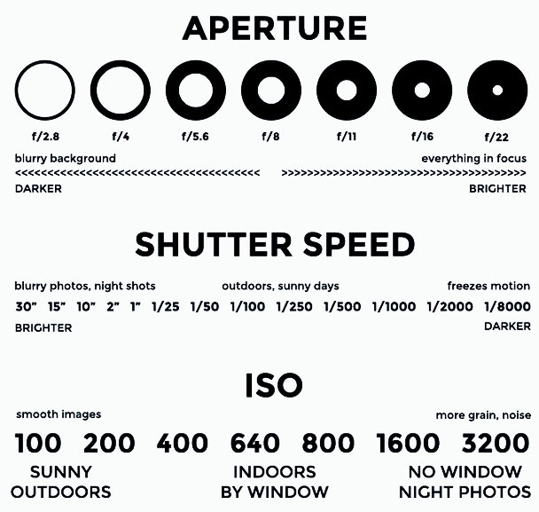
ISO, aperture, and shutter speed all work together. These settings can help you achieve certain creative effects, but you have to keep in mind that if you adjust one setting, the other two will be affected. You’ll have to adjust all three in order to maintain perfect exposure. Refer to the chart below to see how they affect your photos.

 
Exposure cheat sheet. Aperture, shutter speed, and ISO settings for digital photography.
 

Your DSLR should have a light meter to gage your exposure. If your meter is at 0, your photo is perfectly exposed; -2 is underexposed, and +2 is overexposed.

If your pictures are too bright, try upping your shutter speed, increasing your aperture, and/or reducing your ISO. If your pictures are too dark, reduce the shutter speed, decrease your aperture, and/or increase the ISO.

Using a Beauty Dish

A beauty dish is a type of light modifier popular among portrait and fashion photographers. The metal disc is attached to a light source, and its parabolic shape reflects back into and out the sides of the dish. The result is dramatic lighting that wraps around the subject.

Beauty dishes produce semi-hard light — softer than a strobe but harder than a softbox — with soft edges. They’re popular for portraits because they create contrast and can highlight cheekbones, muscles, and other facial features. Some photographers like to set up the beauty dish to point downwards at the model to accentuate bone structure and highlight the eyes, lips, nose, and chin. 

beauty dish

Rather than diffusing light, as many other modifiers do, beauty dishes reflect light and distribute it towards a focal point. And because the light wraps around the model, there is no “hot spot” in the middle, as there often is with other types of reflectors. To create softer lighting and a dramatic effect, the beauty dish can be covered with a diffuser called a honeycomb grid or sock.

Beauty dishes have a sweet spot where they work best. You’ll want to experiment to see where it best accentuates your subject’s features. Typically, they’re placed close to the model — about 6 inches to 2 feet from their face. To see some examples of setups, check out these links: 

Adorama
Tuts Plus
Expert Photography