for your portfolio ...
- Don’t include all of your work – just your best. Be selective and show what you’re proud of.
- What type of work do you want to be hired for? Make this the focus of your portfolio.
- Keeping that in mind, you’ll also want to show your range.
- Be strategic about the order. Place your best photos at the beginning and end. Draw your visitors in, and then make the ending memorable.
for your website design ...
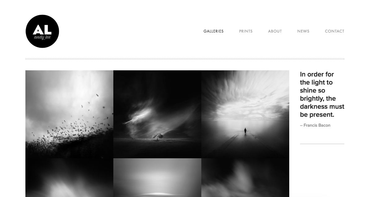
- Use a simple, clean design. Let your photography be the focus.
- If you’re using a template, make it your own: change the fonts, colors, etc.
- Don’t go overboard: stick to just a couple fonts.
- Make the navigation simple and easy to use, without too many menu items. If all you have is “about,” “contact,” and “portfolio,” that’s fine.
- Make your contact information easy to find. Depending on your layout, you may want to put it in your footer or header so that it shows up on every page.
- Understand your audience. What type of clients are you trying to attract? This will affect your design choices. If you’re a corporate photographer, for example, your fonts and colors should convey professionalism. Wedding photographers typically make use of white space and feminine typography.
for your about page ...
- Make it clear, concise, and creative.
- What’s your approach to photography? What do you love about it? Tell the story of what led you to this point of view. Talk about how you got started, and what your plans are for the future.
- Make it personal. Include a few unique details about yourself.
- Make sure to have a great self-portrait!


